Nando’s
A large‑scale replatforming programme replacing Nando’s outdated Drupal estate with a unified, headless platform designed to improve performance, accessibility, and long‑term content scalability.
In Detail
The Nando’s customer‑facing websites form a crucial part of the brand's UK and Ireland digital estate, supporting high volumes of traffic across both in‑restaurant and off‑premise journeys. The platform underpins in‑restaurant table ordering, third‑party delivery integrations such as Deliveroo, e‑commerce, editorial content, and recipe publishing.
Over time, this estate had accreted around a strained Drupal‑based platform that had reached end of life, introducing mounting security risks, materially degrading performance, and blocking further development. This replatform was not simply a content migration, but an important and necessary reset of the underlying delivery model. Beyond addressing end‑of‑life risk, the project aimed to establish a modern, headless foundation capable of supporting future growth, improving performance and accessibility, and enabling internal development teams to iterate with greater confidence and autonomy.
Just as importantly, it also created an opportunity to build a far more consistent and capable platform from the ground up. Through shared components, improved editorial workflows, stronger structured data, modern deployment via Vercel, and the introduction of tooling and frameworks for observability, feature switching, and A/B testing, the new implementation made it possible to deliver faster whilst producing a more coherent, scalable, and better‑performing website.
A Shared Component Library
A major part of the replatforming work was the introduction of a shared component library, documented in Storybook and distributed as a versioned NPM package for use across Nando’s projects. Rather than building components and pages in isolation, the platform was structured around reusable React components consumed consistently via Yarn.
This allowed changes to be made centrally and reused across the platform, improving consistency, maintainability, and delivery.
Patterns, Angles, and Tears
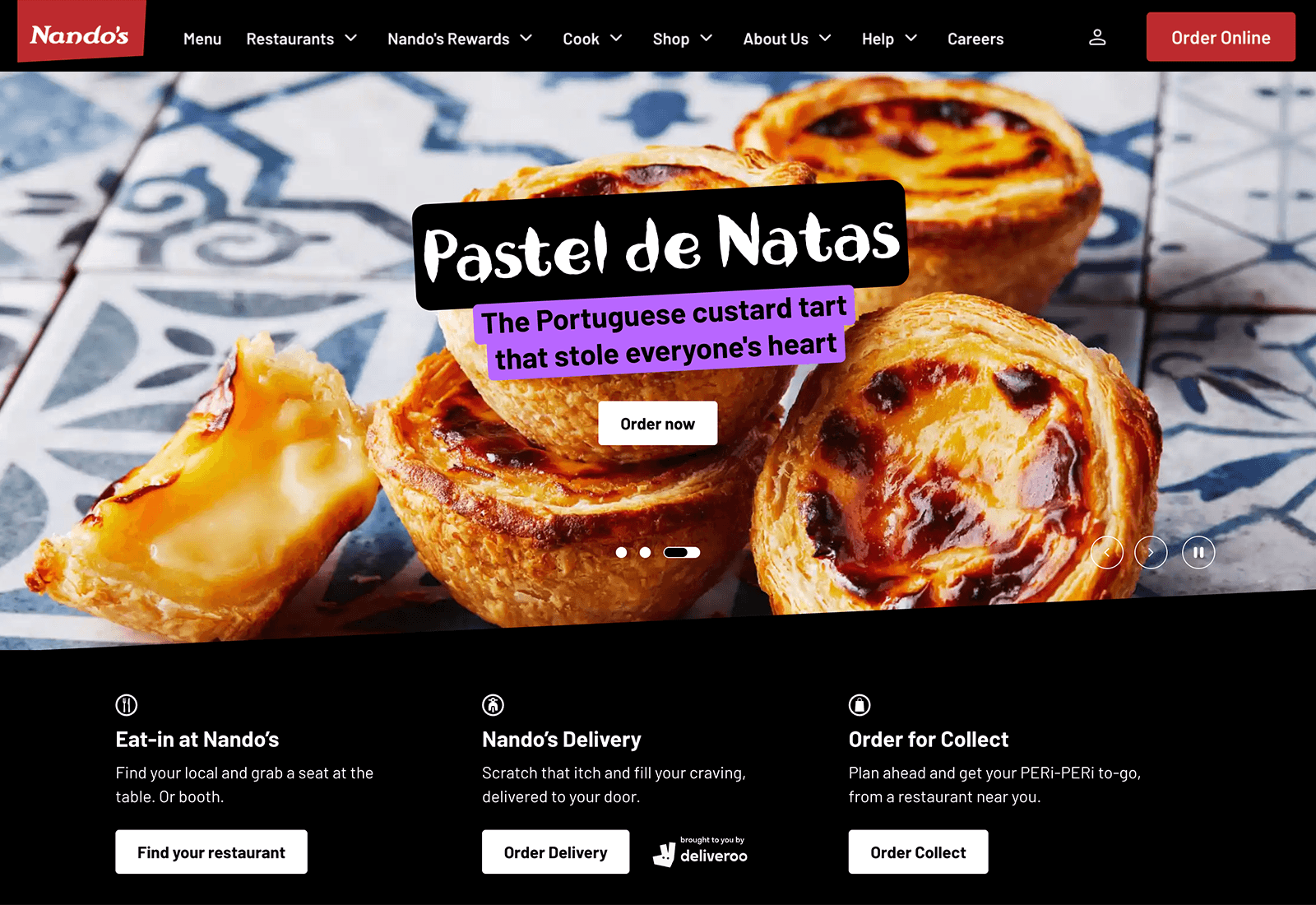
The Nando’s story begins in 1987 with the redesign deliberately carrying that heritage forward through the repeated use of 87° angles (three degrees off horizontal), paired with African‑inspired patterns and tear textures. These are not decorative flourishes, but structural motifs that directly shape the layout and flow of the interface.
Implementing those angles consistently across viewports proved challenging without resorting to structural images, layout hacks, or performance compromises. CSS clip‑path, combined with a small amount of manual trigonometry, ensures the slants behave predictably as viewports change.
To extend this design system into authored Storyblok content, sections are generated automatically using semantic landmark elements (h1, h2, img, video, etc.) and minimum section lengths, allowing the themed slants and patterns to be applied consistently without manual configuration.
An All‑New Header and Footer
Another major piece of the replatforming work was the introduction of an entirely new header and footer. As with similar work I had previously delivered for Virgin Atlantic, this was built as a responsive, accessible, content‑driven navigation system designed to work reliably across a wide range of screen sizes and interaction modes.
Particular attention was given to keyboard accessibility and responsive behaviour. On desktop screens, as available space changes, navigation items are dynamically folded into an additional "More" menu, allowing the header to adapt cleanly without breaking layout or usability. The result was a more robust and flexible global navigation experience, better suited to the needs of a modern content‑managed platform.


Real‑Time Editing with Storyblok
As is often the case with headless CMS solutions, content editing had previously been disconnected from the website itself, with editors working through abstract forms with little visibility of how changes would actually appear. This created friction in the publishing process and made even simple updates slower and more error‑prone.
I introduced live preview editing via Storyblok, allowing editors to work directly against the page in real time. Changes can be made, reviewed, and published within the context of the actual layout, significantly improving accuracy and reducing iteration. This brought the editing experience much closer to a traditional CMS, while retaining the flexibility of a headless architecture.
Structured Data Across the Entire Website
Schema.org was not previously part of the implementation, and there was no consistent approach to how structured data should be generated or maintained. I introduced a scalable model across the platform, building reusable factories to generate context‑specific metadata as each section of the website was migrated. This included global structures such as breadcrumbs, as well as deeper coverage for content types such as restaurant pages and recipes, including extracting ingredients and step‑by‑step instructions from rich content.
This work, alongside the wider replatforming effort, significantly improved how the site is understood by search engines. It contributed to a substantial uplift in organic performance, including a 1,134% increase in impressions, 95% growth in organic traffic, and 76.8% increase in organic revenue.


Restaurant Pages, Rebuilt Around User Intent
Although the restaurant pages had already been through an earlier proof‑of‑concept iteration onto the new platform, as the rest of the project matured, it became clear that they needed revisiting again. The previous version gave too much space to a large hero image, pushing genuinely useful information further down the page and making the experience less practical than it should have been.
I reworked the page to bring key details such as address, opening hours, ordering options, and amenities much higher up, making it immediately more useful. I also introduced extensive schema.org metadata across the restaurant pages (as I had done across the rest of the website), contributing to a substantial uplift in search visibility and a near doubling of traffic.


A New Look and Feel
Alongside the wider technical replatforming work, the project introduced a substantial visual refresh across the website. Legacy pages were often inconsistent in layout, spacing, and hierarchy, with design decisions varying significantly between sections.
The updated implementation brought a much more consistent and cohesive experience across key page types, with clearer structure, stronger visual hierarchy, and a more modern presentation throughout. The result is an interface that aligns more closely with the brand and improves both clarity and usability across the site.


