Selfridges
Lead developer at Selfridges within the Customer Experience team, improving a fragmented e‑commerce platform during the Covid lockdowns as online demand increased sharply.

In Detail
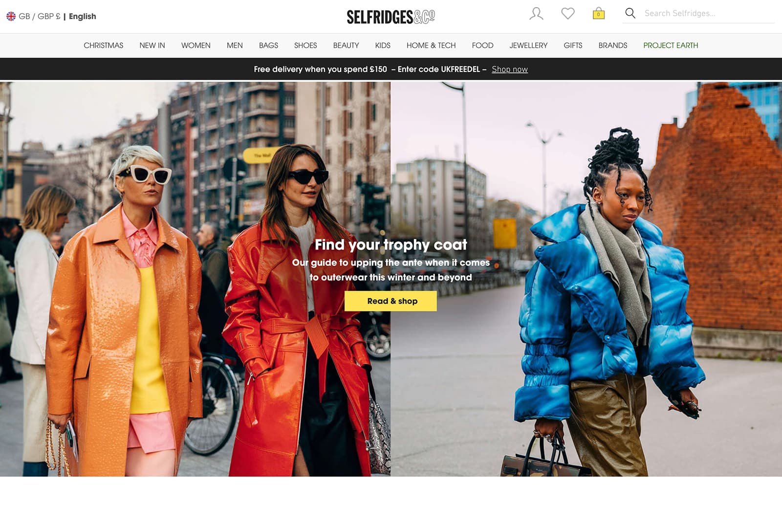
After a brief hiatus from working in e‑commerce, I joined Selfridges in June 2020 in a capacity familiar from my time at John Lewis. During the first Covid‑19 lockdown, Selfridges had seen an enormous spike in website traffic and demand for online services. I joined the Customer Experience team as a lead developer, providing consultation and technical delivery support during that increase in demand.
The website sat on a set of disparate codebases: the relics of three previous, partial attempts to modernise the platform, each still powering a significant portion of the site. This created notable inconsistencies in the user experience, with even fundamentals such as page width changing from one screen to the next.
The splintered codebases also slowed delivery. In most cases, a development change had to be carried out in three separate places, using three different technology stacks.
Rather than build yet another fourth shard into the application, we chose to work with the most recent React attempt. The first experiment was to embed a new React component into all three sections of the site. Once that proved successful, we were able to progressively introduce common components across the platform.
This also allowed us to improve sections of the site that customers found most problematic. Notably, we overhauled the Product Listing Page and Product Details Page journeys, introducing new filtering options and a quick‑filter system to let visitors select common combinations of filters.
Following these improvements, conversion increased by over 65% in the next month, just in time for the UK to enter its second Covid‑19 lockdown…

Product Listing Page
A significant overhaul of the Product Listing Pages addressed difficulties visitors had been experiencing when narrowing product sets and finding specific products, a common e‑commerce problem I had come across before. The work introduced a new filtering system alongside a quick‑filter system that allowed multiple common filters to be added and removed quickly.


Product Details Page
The PDP had historically performed poorly for visitors using mobile and touch‑screen devices. During the 2020 Covid‑19 lockdowns in the UK, Selfridges saw a sudden rise in website traffic, particularly on mobile devices. The PDP was overhauled to improve interactions and visibility for those users, increasing conversion by over 65% in a month.


Brand Directory
A development piece I took on personally, the Brand Directory had historically been little more than an alphabetised list of links and was rarely visited. The rebuild introduced a new design, more accessible on‑page navigation, and a much‑improved mobile experience, making the page more useful for customers browsing Selfridges by brand.


- "
I had the pleasure of working closely with John Kavanagh at Selfridges. He is an exceptional programmer who consistently delivered high‑quality work. John possesses a deep understanding of exceptional front‑end development skills and has a remarkable ability to tackle complex problems with creative and effective solutions.
What sets John apart is not only his technical expertise but also his strong work ethic and dedication to delivering results. He is a reliable and proactive team player, always willing to go the extra mile to ensure project success. I was particularly impressed with his ability to help with issues and make the explanations simple and succinct.
Beyond his technical skills, John is a pleasure to work with. He communicates effectively, collaborates seamlessly with team members, and approaches challenges with a positive and solution‑oriented mindset."
- "
I was lucky enough to work with John Kavanagh at Selfridges on the CX Team for the better part of a year. Throughout that time John's expertise and insight were invaluable in helping get projects started and over the finish line. He is a very approachable, diligent, and good‑humoured Front‑End Developer and I hope to work with him again soon!"