Enhancing Web Typography with text-wrap: balance
Exploring the synergy of text-wrap: pretty and text-wrap: balance in web typography, enhancing text aesthetics and readability in different contexts.
Articles
Web typography is often decided in the last few pixels of a line rather than in the choice of font. These articles look at wrapping, widows, and orphans: small layout details that can make text calmer and easier to read without turning the page into a design exercise.
text-wrap: balanceExploring the synergy of text-wrap: pretty and text-wrap: balance in web typography, enhancing text aesthetics and readability in different contexts.
text-wrap: prettyHow text-wrap: pretty can improve paragraph wrapping in CSS, with practical examples, browser‑dependent results, and a progressive enhancement approach.
Orphans are annoying single‑word lines of text that hang at the end of a paragraph. It is straightforward using React and JS to banish them from your site.

In typography, a 'widow' is the last line of a paragraph, which falls alone on the following page or column. On the web, this can be easily tackled with CSS.
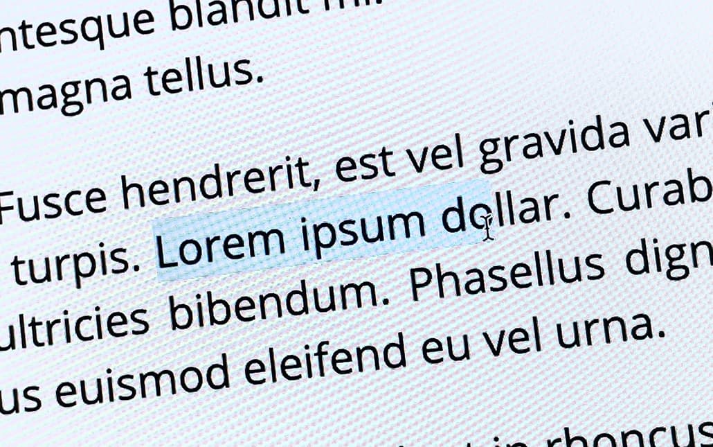
Disable text selection with CSS user‑select, including browser prefixes, input caveats and a visual ::selection fallback for older browsers.