The Power of text-wrap: pretty
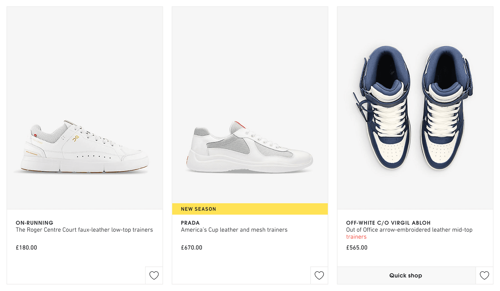
A few years back, I published an article 'Using JavaScript to Avoid Orphans' where I shared a solution for the common typographic challenge of preventing orphans (or 'runts') ‑ where single words fall onto the last line of a paragraph. At the time I had been working for a prestigious UK department store improving their customer experience, where one of the tasks presented had been to improve the way that text was displayed on their product listing pages, by removing errant runts from the product titles:
At the time, the solution was simple: use JavaScript to wrap the final two words in a string in a <nobr> element (albeit a non‑standard HTML element) or otherwise in a <span> with the inline style white-space: nowrap;.
I liked this feature so much that I used it extensively across the version of my personal website at the time.
With the new pretty value for text-wrap, we can ask supporting browsers to improve line breaks directly in CSS. It is a useful progressive enhancement, although browser support and the results still need checking for the text we are displaying.
text-wrap: pretty gives the browser room to choose better breaks, including avoiding very short final lines where its algorithm can do so. It is not a guarantee that every paragraph will be free of runts.
A Quick Recap on Orphans in Typography
I've gone into detail on what orphans in typography are before but for the sake of a quick recap... Orphans, (sometimes referred to as 'runts') in typography, are single words that fall on their own line at the end of a paragraph, isolated on the last line.
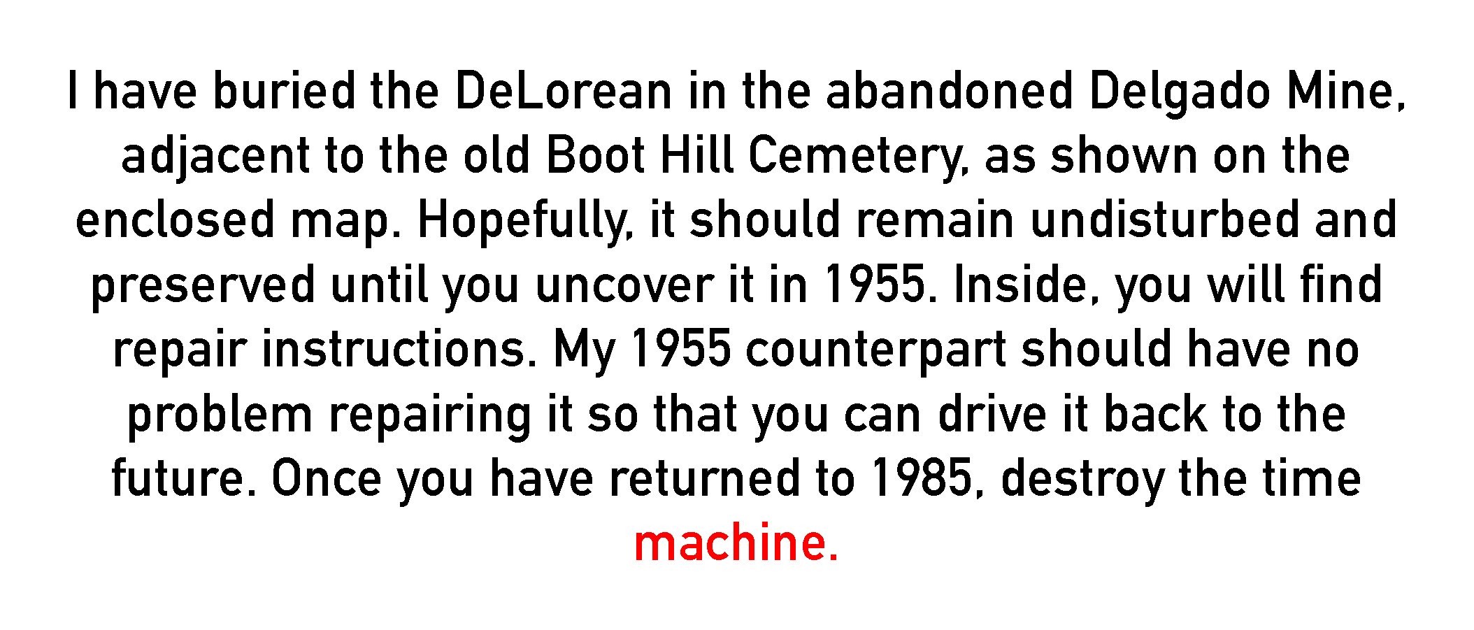
I used the letter that Doc wrote to Marty in Back to the Future Part II previously to illustrate this, so it makes sense to use another excerpt from it to illustrate this phenomenon again now. Here, you can see that the last word ('machine') falls onto a line all on its own. I've highlighted it in red just to make it really obvious.
These lone words disrupt the visual harmony and readability of the text, creating an uneven and ‑ some feel ‑ an unprofessional look. In web design, avoiding orphans can be really difficult, especially when you have fluid‑width layouts to contend with. However, they can cause awkward gaps, draw attention away unnecessarily, and break the reader's flow, detracting from the overall aesthetic and content. Finding a way to ensure that the text we display on‑page is visually appealing can be a quick way to improve a user's experience.
Understanding text-wrap: pretty
The pretty value is part of the CSS Text Level 4 draft. It asks the browser to favour better wrapping over the fastest line‑breaking approach, considering more than one line when choosing breaks.
In action, it looks like this:
Avoiding short final lines is one possible improvement. Decisions about hyphenation and other breaks depend on the browser's implementation; pretty does not prescribe one identical layout for every engine.
We are still in the early days of this type of more typography‑focused CSS capabilities; I expect that we will see further enhancements to text-wrap: pretty in the future.
From JavaScript to CSS
My earlier solution adjusted the text with JavaScript, although that transformation could also run during server rendering. Keeping the final words together can also be done in the markup. Those approaches give us explicit control over a particular break.
text-wrap: pretty is easy to apply and leaves the wrapping decisions to the browser. That can simplify our code, but better line breaking can take extra work. It is not automatically faster than a text transformation, and different browsers may choose different breaks.
In Practice
To demonstrate text-wrap: pretty in action, let's consider a real‑world scenario: enhancing the readability of my blog posts. In my CSS, I simply apply the property to paragraph elements across the site:
p {
  text-wrap: pretty;
}
The browser can now reconsider the paragraph's breaks. In this captured example, the left‑hand paragraphs use ordinary wrapping and the right‑hand paragraphs use text-wrap: pretty:
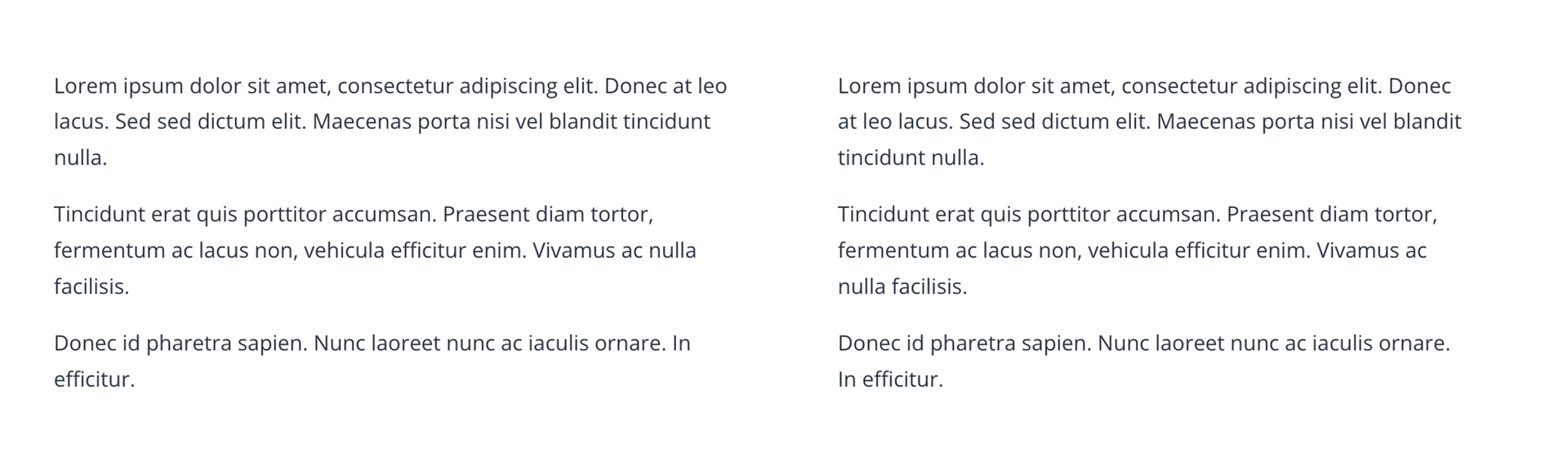
In this example, the version with text-wrap: pretty avoids the single words stranded on the final lines. The result depends on the text, font, available width and browser; a different paragraph may still end with a short line.
For headings and other short text, there is also text-wrap: balance. It aims for more even line lengths, which is a different goal from improving the overall wrapping of a paragraph.
I go into much more detail about balance and compare it against pretty in my article 'Enhancing web typography with text-wrap: balance'.
With all this said, it is important to be aware of the limitations here. As text-wrap: pretty is part of an as‑of‑yet‑unfinished standard, it is likely to evolve and change as time goes on. Browser support is also generally ok but not amazing. I would personally argue that for something like this, it's a nice additional enhancement that improves user experience, but it's not entirely essential for the users to use and appreciate the content, so having some limitations in support this early in its release is expected, and that's okay.
The Future of Web Typography?
As I mentioned earlier, the introduction of new features to text-wrap hints at an exciting future for web typography, where CSS continues to evolve to meet the complex needs of digital design.
This movement towards more sophisticated and typography‑focused CSS properties suggests a future where designers may have even greater control and flexibility to control text rendering directly within the CSS, helping to reduce reliance on JavaScript for visual refinements. As web standards evolve, we can expect to see more such properties that enhance readability and aesthetic appeal.
It's an exciting time for web developers and designers to experiment with these new capabilities, like text-wrap: pretty, and provide feedback that could shape future CSS developments.