Choosing a React Component Library with a Tested Product Feature

An account‑edit dialog is a useful place to make a component library earn its place. When an email address is rejected, the dialog needs to keep the entered values and associate the error with the right field. Once the save succeeds, focus needs somewhere sensible to go.
That small feature tells us rather more than a wall of button styles. It exposes the work a library supplies, the work the application still owns, and the awkward states that a cheerful demo tends to leave out.
I built the same account editor with React Aria Components and Radix Dialog plus native form fields. Both use the same state, validation, simulated save service, and CSS tokens. I've compared current and previous package versions, measured the production bundles, and run the same browser tests against both, including hydration. That gives us something concrete to choose between for this feature, without pretending to review every component in either library.
Choose a Feature That Can Disappoint You
The editor has a required name, an email address, and an email‑preference checkbox. There are two accounts on the page so that reused identifiers and shared state have somewhere to go wrong.
The save service has three outcomes: success, an email address already in use, and a transport failure. The first closes the dialog and updates the visible account. The others leave the entered values available for correction or retry. An invalid client‑side submission never reaches the service.
That gives both implementations the same observable requirements:
- Opening places focus in the name field, and Tab works in both directions within the modal.
- Escape and Cancel close an idle editor and return focus to its trigger.
- Errors identify the relevant field and focus it after the error markup exists.
- Pending work cannot submit twice, and its focus behaviour remains usable.
- Saving one account doesn't change the other account's values or identifiers.
The WAI modal‑dialog pattern provides the starting interaction model. There are still a few decisions for us to make. This example prevents dismissal during its short, controlled save and updates a status message outside the closed dialog. Opening the editor clears the previous confirmation, so saving the same name again still changes the status message. A real service needs an explicit timeout or cancellation policy; we shouldn't leave someone stuck in a dialog if the request never finishes.
A date picker, a large data grid, or an international address form would expose different selection criteria. Pick the feature your product actually needs, especially if it combines components in a way the library examples don't show.
Compare the Division of Work
React Aria supplies field primitives as well as the modal. Its TextField, Label, Input, and FieldError compose the email field:
<TextField
  className="field"
  name="email"
  type="email"
  isRequired
  value={editor.values.email}
  onChange={value => editor.update('email', value)}
  isDisabled={editor.pending}
  isInvalid={Boolean(editor.errors.email)}
>
  <Label className="label">Email</Label>
  <Input className="input" ref={editor.emailRef} autoComplete="email" />
  <FieldError className="error">{editor.errors.email}</FieldError>
</TextField>
The Radix implementation uses its dialog primitives and ordinary HTML fields. It therefore supplies the field identifiers and associations in application code:
<label className="label" htmlFor={emailId}>Email</label>
<input
  className="input"
  id={emailId}
  name="email"
  type="email"
  required
  ref={editor.emailRef}
  value={editor.values.email}
  onChange={event => editor.update('email', event.target.value)}
  disabled={editor.pending}
  aria-invalid={editor.errors.email ? true : undefined}
  aria-describedby={editor.errors.email ? emailErrorId : undefined}
/>
{editor.errors.email && (
  <p className="error" id={emailErrorId}>{editor.errors.email}</p>
)}
Either approach can work. If your team already has native field components, you may have those identifiers and error associations covered. If you're starting a form‑heavy application, React Aria's field components give you more of that work ready to use.
It's worth being fair about what we're comparing here. Radix Dialog provides the modal behaviour, and the application supplies the native fields. React Aria supplies both. Radix has other primitives, but this experiment doesn't import them merely to make the dependency lists look symmetrical.
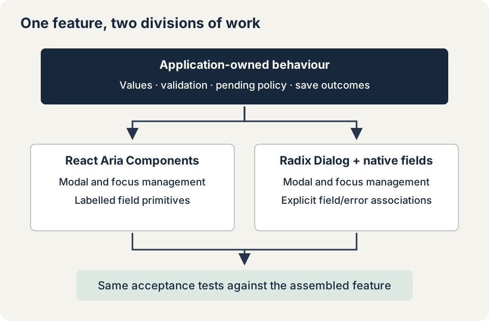
Both versions use one useEditor hook. It owns values, errors, the pending flag, and save outcomes. React Aria's form uses validationBehavior="aria"; the native form uses noValidate. That keeps the shared product validation responsible for whether submission proceeds. React Aria's form documentation explains the difference between native blocking validation and exposing validation through ARIA.
The test includes a whitespace‑only name and a@b, which the example's deliberately simple email rule rejects. This is a product‑rule comparison, not a complete email‑address parser. Server validation remains necessary regardless of which components render the form.
Make the Pending State Part of the Test
A save button's disabled styling doesn't prevent two calls already entering a handler before React renders the new state. The shared handler uses an immediate ref guard, then exposes pending state for rendering:
if (pendingRef.current) return;

const result = validate(values);
setErrors(result);
if (Object.keys(result).length) return;

pendingRef.current = true;
setPending(true);
The guard is released in finally, so a failed save can be retried. Field errors receive focus in an effect after React has committed the associated error nodes. A transport failure focuses the save action, with a visible alert explaining that the entered changes remain available.
Pending keyboard behaviour needed more care than the happy path. Once fields become disabled, focus can no longer remain usefully on the field from which a keyboard submission began. The example moves focus to the save action whilst the request is running. Save and Cancel remain in the focus order with aria-disabled, and their handlers reject activation whilst the save is active.
That distinction matters: aria‑disabled communicates state but does not suppress an action by itself. The handler guard and the disabled styling are still application responsibilities.
To check what happens if we get this wrong, I held the save promise open and applied native disabled to both remaining actions. Focus could then leave the dialog: it reached the document body with React Aria, and could reach the other account's trigger with Radix. Keeping the actions focusable and moving focus to Save prevented that in both versions. Neither library's default dialog was broken; disabling everything had removed the controls its focus handling needed.
The browser suite also dispatches two submissions before a render can disable anything and checks that only one save call occurs. Holding the promise explicitly makes that assertion reproducible. A 500‑millisecond timer alone proved too easy to race during testing.
Measure What This Feature Actually Ships
The current comparison uses React and React DOM 19.3.1, React Aria Components 1.22.1, and Radix Dialog 1.3.1. The build uses esbuild 0.25.12, an ES2022 target, production mode, and minification. Both implementations import the components they use and include the same application logic.
These are the measured JavaScript bundle sizes after gzip compression:
| Build | JavaScript bytes, gzip | Difference from the empty shell |
|---|---|---|
| Empty React settings shell | 69,349 | Not applicable |
| Radix Dialog and native fields | 84,520 | 15,171 |
| React Aria Components | 102,821 | 33,472 |
The shared minified stylesheet adds 908 gzip‑compressed bytes to either feature. Raw and Brotli sizes, the exact lockfile, and build metadata are retained with the local comparison. You can download the component‑library comparison.
The difference column is a subtraction between two complete compressed bundles. It isn't the size of an independently downloaded "Radix chunk" or "React Aria chunk". Compression context, shared dependencies, code splitting, and an application's existing components will change the result. React is included in all three builds rather than silently excluded from one candidate.
Radix is smaller for this feature under these build settings. That is useful evidence, but it doesn't demonstrate faster interactions or lower maintenance cost. No user‑device timing comparison was run. If a product already ships React Aria controls elsewhere, adding this editor may have a very different marginal cost.
Installed package size would have answered a different question. So would comparing a Radix dialog alone with every exported React Aria component. Measure the import graph you intend to ship.
Rehearse the Upgrade Before Choosing the Foundation
A new implementation can hide the cost of keeping it working. The same source and browser suite were also built against React Aria Components 1.21.1 and Radix Dialog 1.2.0, then repeated against the current pins. Both previous/current pairs passed the exercised behaviour and their TypeScript checks without an adapter change.
The previous React Aria bundle was 101,490 gzip bytes, compared with 102,821 for the current version. The Radix pair was 84,444 and 84,520 bytes. Those are observed changes for this import graph, not estimates of either release's overall size.
Both older packages were installed under aliases, so the tests ran against those versions. This was a small upgrade for one feature; a major‑version migration or a different set of components could need more work.
Inspect the release notes for the APIs your product uses. Here the React Aria releases and Radix releases provide the relevant starting points. A date input, collection widget, or nested overlay could introduce upgrade work that this account editor never exercises.
Keep the accepted feature states as regression examples. They fit naturally into the broader design‑system workflow with documented components and package releases. A library decision should leave behind something a later upgrade can actually run.
What Still Needs Checking
All four builds passed the shared Chrome 157 interaction suite. The page starts with both dialogs closed on the server, hydrates, then opens them in the browser. That sequence produced no captured hydration warnings or page errors. It doesn't prove server‑rendered open overlays or every framework integration.
The visual checks covered a 390‑pixel viewport, dark colours, a long German field label, and right‑to‑left layout. Those checks help expose layout problems, but there's more to localisation than that. Currency conventions, translated validation messages, and language‑specific input rules remain separate requirements. Native browser zoom still needs a manual check.
The axe‑core 4.14.0 run reported no violations under the selected WCAG A/AA rules. It requested manual review of aria-hidden-focus in the Radix variants, including the hidden page and focus guards. The keyboard tests cover containment for the exercised paths; they don't turn that incomplete result into a general accessibility pass.
I haven't yet tested these examples with VoiceOver in Safari or NVDA in Firefox. Before using either version in a product, I'd check what those screen readers announce for field errors, pending saves, failed‑save alerts, and restored focus. The automated checks give us a useful comparison, but those remaining checks could still change the decision. The distinction is the same one discussed in accessibility for reusable components: useful primitives still need a usable assembled feature.
For a new system dominated by forms, I would provisionally favour React Aria here because its field relationships reduce the manual conventions the application has to carry. I would accept that choice only after the remaining accessibility checks and a route‑level budget review. For a product with established native fields that mainly needs reliable modal behaviour, the tested Radix version has a smaller bundle and leaves those existing fields in place.
Both versions passed the same tests, but the better fit depends on what your application already has. Keep the example and the reasons for your choice together, so that the next person reviewing the library has more to go on than a bundle‑size table.